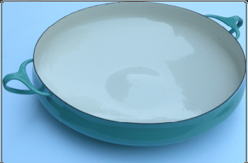
Friday’s news about the closure of all but three Habitat stores was sad.
Habitat was ground-breaking. With its launch in the early 1960s Terence Conran transformed British attitudes to home design and furnishing. Simple glassware, brightly coloured enamelled mugs and coffee pots, flatweave rugs were displayed en masse in tempting visual displays, along with such exotic imports as the ‘continental’ duvet and the chicken brick. It took my family a while to give up sheets and blankets, but we did have a chicken brick.
I remember visiting the Tottenham Court Road branch in my early twenties and being amazed at the range of paints they then sold – really delicious colours that weren’t available anywhere else.
Later I bought four red wooden slatted folding chairs (three are still going strong), a sofa bed that was so well-made that it only gave up the ghost last year, along with other bits and pieces. When Habitat decided to reissue Robin Day’s iconic polyprop chair in the late 1990s I bought six of those too (in pale translucent blue).
End of an era.
 But cityscapes throw up surprising riches. This photograph, taken in King’s Cross station when it was recently being revamped, is by my daughter. The peeled wall, with its smeared colours and vestiges of lettering, is really pleasing to me.


